Media Query CSS


Media queries in CSS are used to apply different styles based on certain conditions such as the size of the screen or the device being used. This allows for the creation of responsive websites that adapt to different devices and screen sizes.
Anatomy of a Media Query

There are several types of devices available in the market. they have their unique set of dimensions. however, we don't need to mention all device breakpoints in our CSS file. some breakpoints will suit almost all devices.
320px — 480px: Mobile devices
481px — 768px: iPads, Tablets
769px — 1024px: Small screens, laptops
1025px — 1200px: Desktops, large screens
1201px and more — Extra large screens, TV
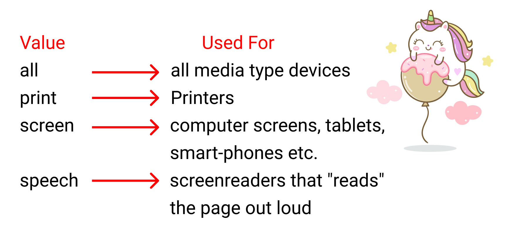
How to Set the Media Type?
Media queries are defined using the @media at-rule followed by a media type, 0 or more media features or both a media type and media features.
Why do we write the "and" operator?
The media type, min-width, and max-width functions are basically conditions we are giving to the browser. We don't write the "and" operator if we have one condition.
/* Extra-small */
@media screen and (max-width: 360px) {
  /* ... */
}

/* Small */
@media screen and (min-width: 361px) and (max-width: 480px) {
  /* ... */
}

/* Medium-only */
@media screen and (min-width: 481px) and (max-width: 960px) {
  /* ... */
}

/* ... */